Member-only story
This article is a repost of an answer I wrote for Stack Overflow.
I first had to dive into the world of font metrics when I was trying to create some custom views to display vertical script Mongolian text. After trying unsuccessfully to modify TextView to behave as I wanted, I finally gave up and decided to draw my own text. The content below was one of the lessons I learned along the way.
Definitions
Let’s first review what the documentation says:
Top — The maximum distance above the baseline for the tallest glyph in the font at a given text size.
Ascent — The recommended distance above the baseline for singled spaced text.
Descent — The recommended distance below the baseline for singled spaced text.
Bottom — The maximum distance below the baseline for the lowest glyph in the font at a given text size.
Leading — The recommended additional space to add between lines of text.
Note that the Baseline is what the first four are measured from. It is the line which forms the base that the text sits on, even though some characters (like g, y, j, etc.) might have parts that go below the line. It is comparable to the lines you write on in a lined notebook.
Here is a picture to help visualize these things:
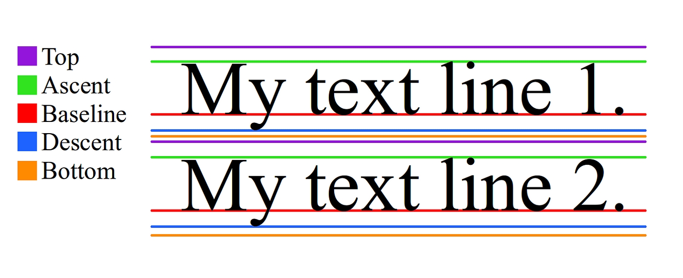
Remember that when drawing on a canvas in Java and Android, going down is an increase in y and going up is a decrease in y. That means that FontMetrics’ top and ascent are negative numbers since they are measured from the baseline (while descent and bottom are positive numbers). Thus, to get the distance from top to bottom you would need to do bottom - top.
The leading is the distance between the bottom of one line and the top of the next line. In the picture above, it is the space between the orange of Line 1 and the purple of Line 2. As MajorTom noted elsewhere, in typography the term is more properly defined as “the distance between the baselines of successive lines of type.”* However, Android seems to use the term in the more historical sense. The word (pronounced “ledding”) comes from the lead…
